
Orange Fish Sushi
Project Overview
The website of Orange Fish, a sushi and all-you-can-eat restaurant in La Verne, California. The heart of the site is the menu: four menus, forty categories and hundreds of dishes that guests browse on their phones, often right at the table.
Our Scope
- UI/UX: structure, menu navigation and the visual direction.
- Frontend: the scroll-stop menu, photo lightbox, mobile quick-action bar and cookie consent.
- Backend: a content management system for the whole menu - categories, dishes, prices, photos and availability.
What Stands Out
As you scroll, the navbar, the menu tabs and the current category header stay pinned at the top, so guests always know which menu and which section they are in. California is strict about web accessibility, so the site was built to pass WAVE checks and score well on Google PageSpeed Insights.
Behind the Menu
- Categories with their own layout, banner and order on the page.
- Dishes with name, Japanese subtitle, price, description, photo and badges.
- One switch to hide a dish when it runs out, and edits that save without reloading.
- A shared photo library, so images are reused instead of uploaded twice.
01See It Move
A Menu That Shows Where You Are
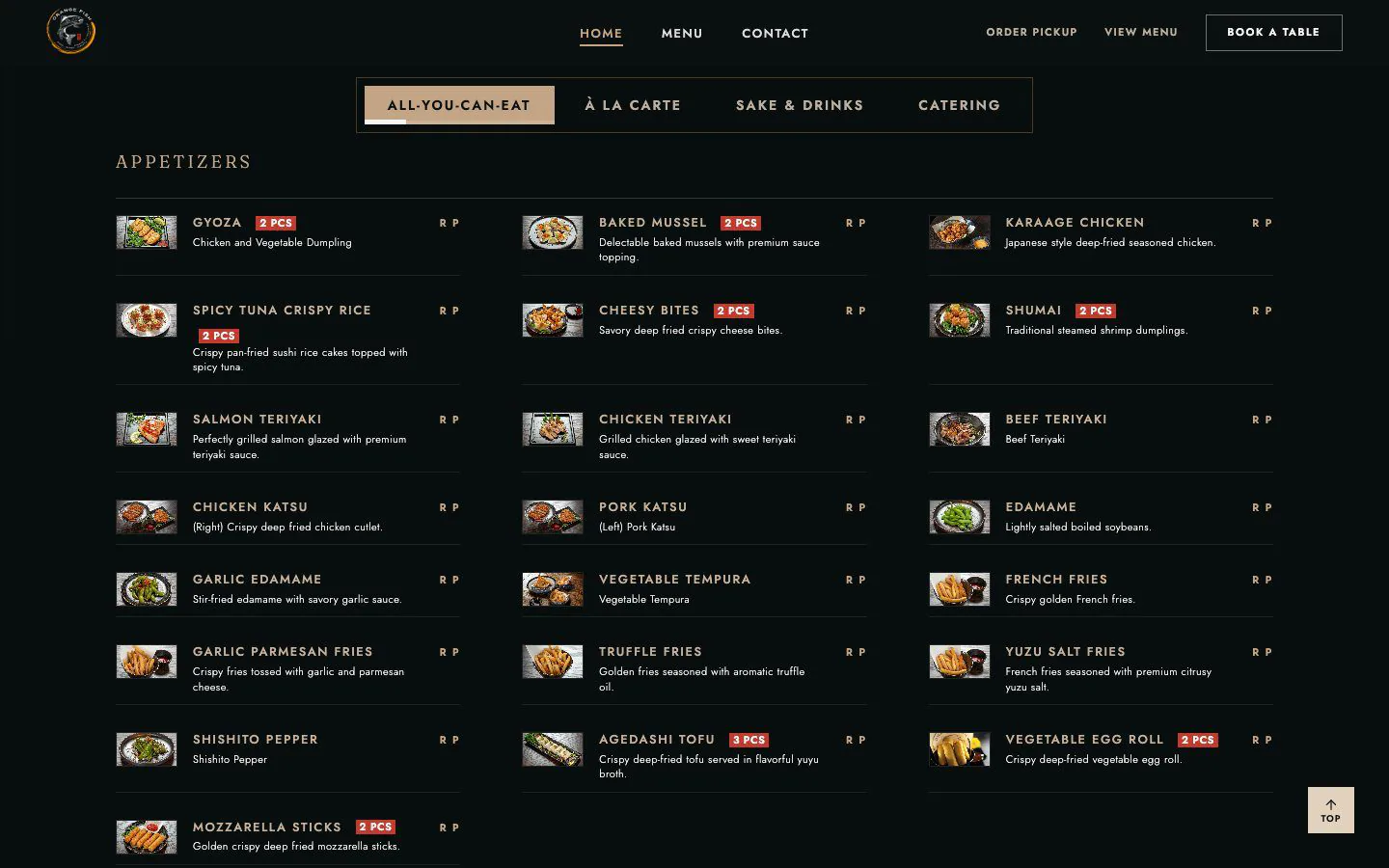
Scroll through the menu and the tabs and category headers stay in place, then switch to another menu.
02Scroll-Stop Navigation
Three Layers That Stay Put
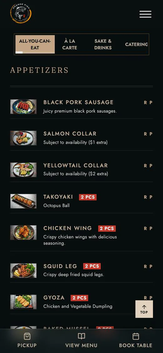
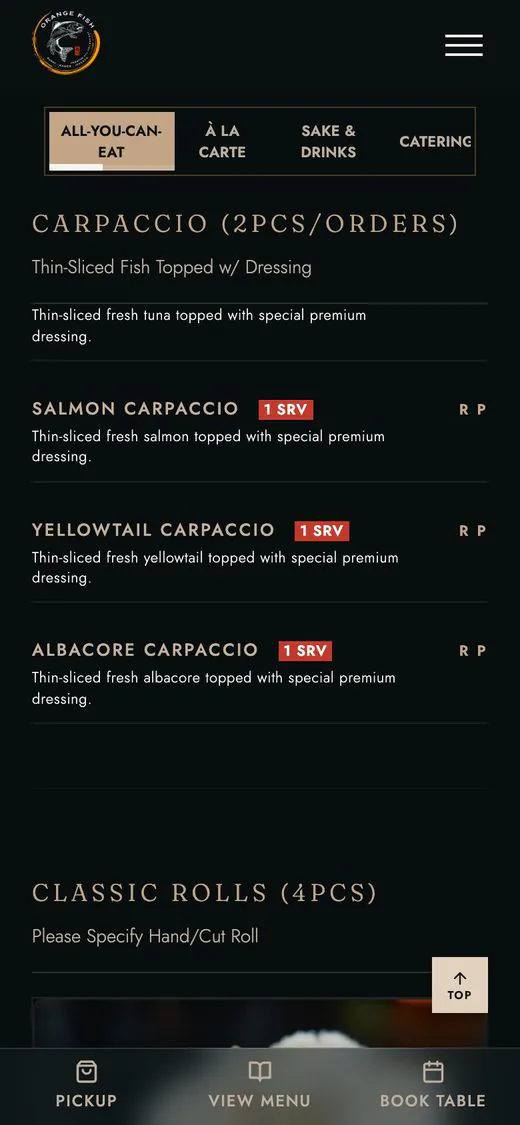
The navbar, the menu tabs and the category header stack at the top of the screen, each one stopping in place as you scroll past it.
-
 01
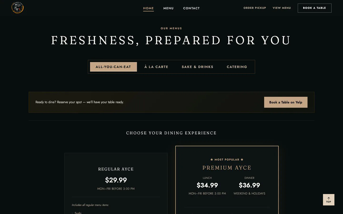
01Pick a menu
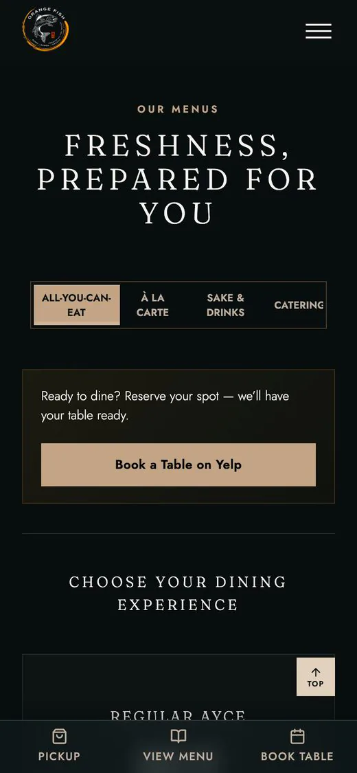
All-You-Can-Eat, À la Carte, Sake & Drinks or Catering - four tabs, one menu section.
-
 02
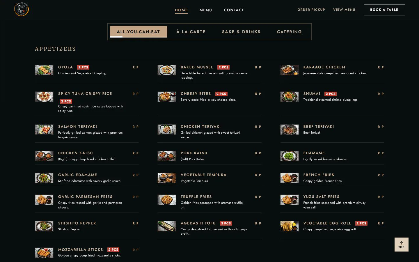
02The tabs stay with you
Once you scroll into the menu, the tabs pin right under the navbar, so switching menus is always one tap away.
-
 03
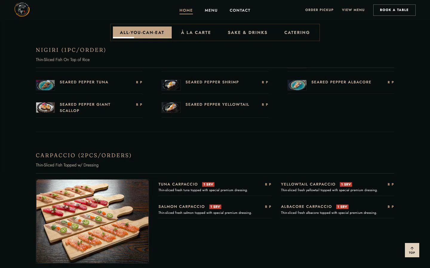
03The category holds
Each category header stops under the tabs until the next one takes over, and a thin bar in the active tab shows how far through the menu you are.
-
 04
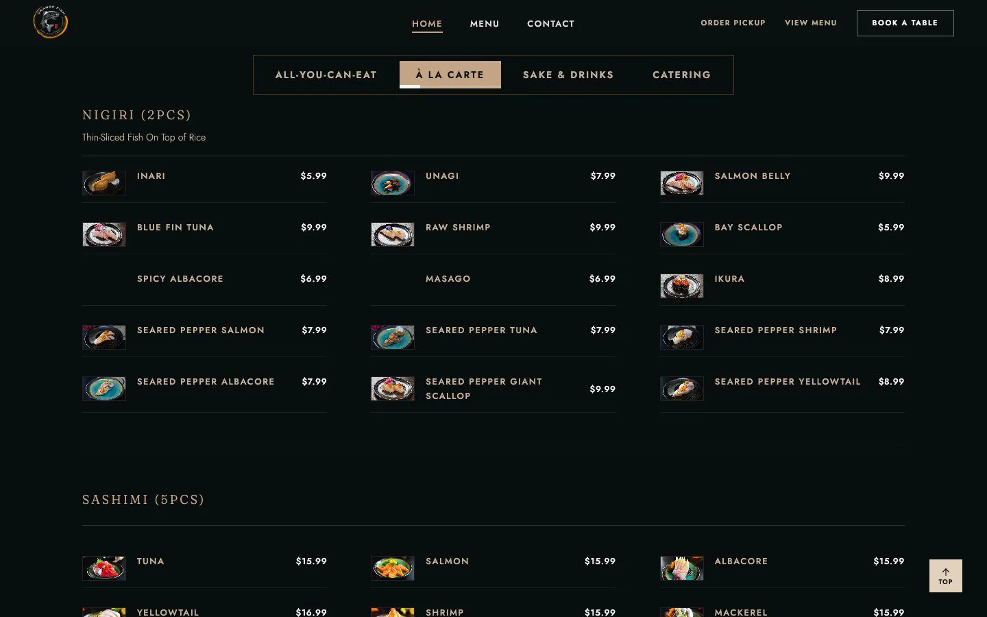
04Switch without losing your place
Changing tabs brings you back to the top of the new menu, with the same pinned headers.
03Responsive
Built for the Table
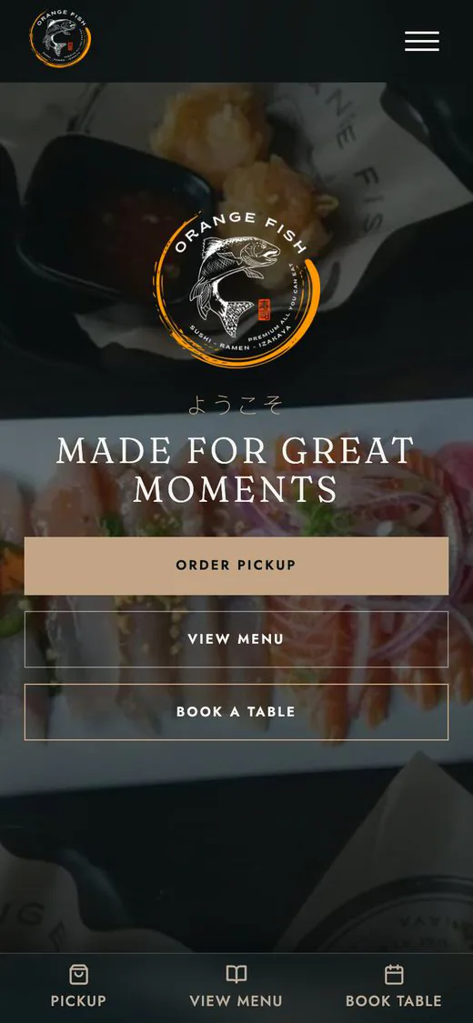
Most guests open the menu on a phone, so the pinned tabs, category headers and a bottom bar for pickup, menu and booking are all designed for small screens.
04Our Work
Explore Others
More of what we have built.
Let's Build The Engine
Bring the idea, or just the problem. We'll shape the experience and build the engine behind it.